Updated: Oct 10, 2024

"Just as a recovering alcoholic must avoid the first drink,
the recovering artist must avoid the first think."
Hello hello! welcome to week 2 & 3 of my journey with The Artist's Way. Please be sure to read how week 1 went for me here :)
These two weeks required a lot more journaling and reading rather than physical activities, so i thought i'd give you a scoop of the events of the two weeks together.
So, here's the deal: I may have planned for these two weeks to be super structured, but life had other ideas and i found myself overshooting the tasks by a day or two. Sometimes, it felt like my week was actually 10 days long – but hey, who's counting?

Now, let's talk about the guilt. Guilt is like that unwanted guest at a party - but if there's anything I've learnt during these past five weeks of morning pages (yes, I'm on week four as I spill the beans) it's that it's all about being kinder to myself. Sure, I might not be a stickler for schedules, but that doesn't mean I'm slacking off. I've got my tasks lined up, and I tackle them with gusto. The twist is, I savour each moment a little longer. I reminded myself that i would rather have my tasks done to completion the correct way, than have them rushed to fit a schedule.
And guess what? I do aim to finish that chapter within a week, but if it stretches a tad long er, it's not the end of the world. i can allow myself that permission - everyone's journey is different, and we're all exploring it in our own, quirky ways.
"In creative recovery, it is not necessary that we change any of our beliefs. It is important that we examine them."

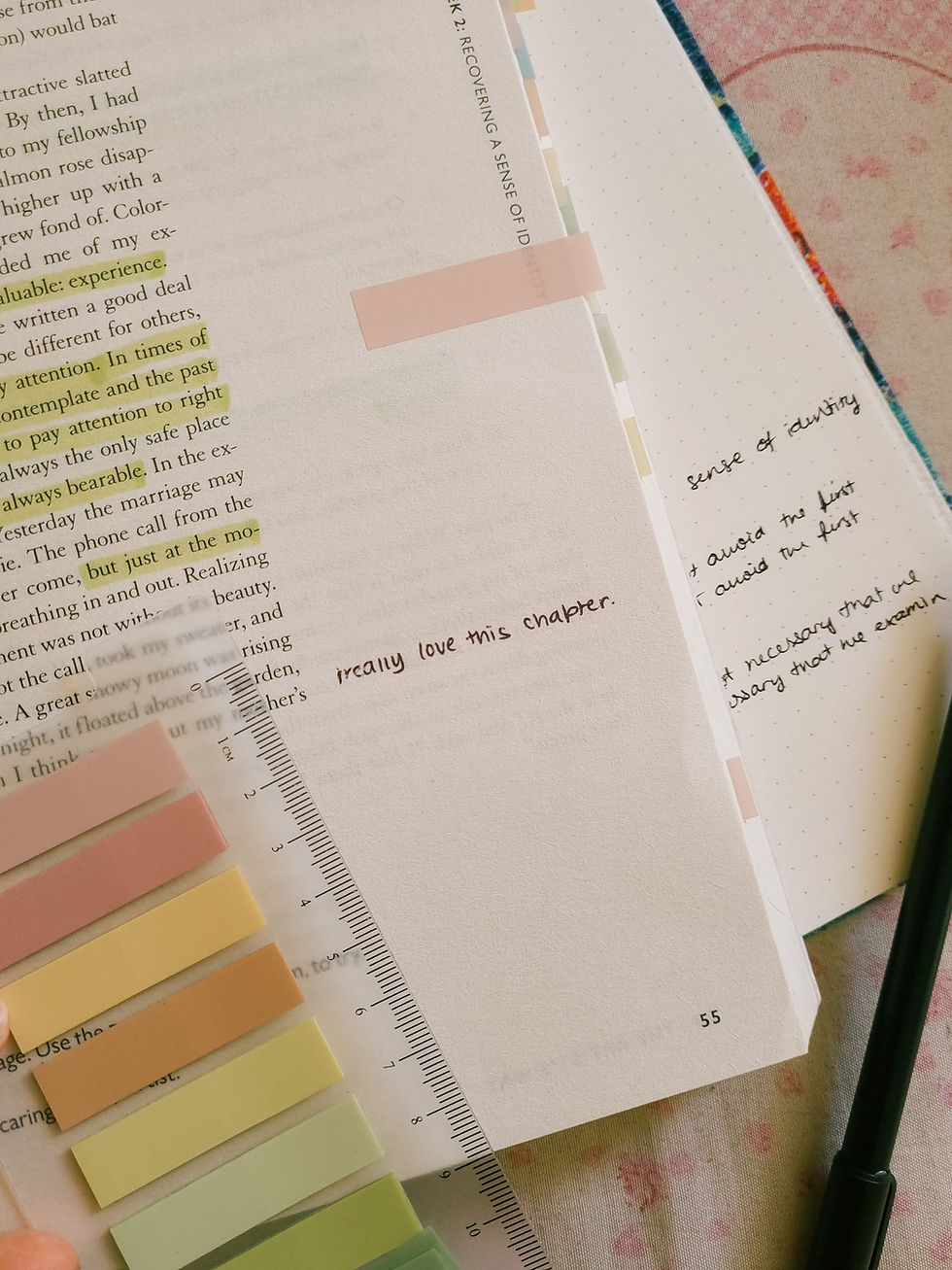
my favourite part from the week 2 chapter was "attention" after reading through this bit i had to close the book and take a moment to myself. Julia Cameron, the author of this book, paints a vivid picture of the importance of living in the now- relishing those tiny magical moments that often pass us by.
Too often i've caught myself living in fear of the past or with anxiety about the future. But Julia, the genius wordsmith that she is, manages to articulate something profound: In this very moment, right here, right now, I'm perfectly okay.
She gently reminds us that life might throw curveballs, and things may not always go as planned. There's a chance of bumps in the road, but in this very instant, we have the power to bask in the beauty of the present. If we miss that, well - that's a regret we don't want to carry with us, no matter how bright the future might seem.
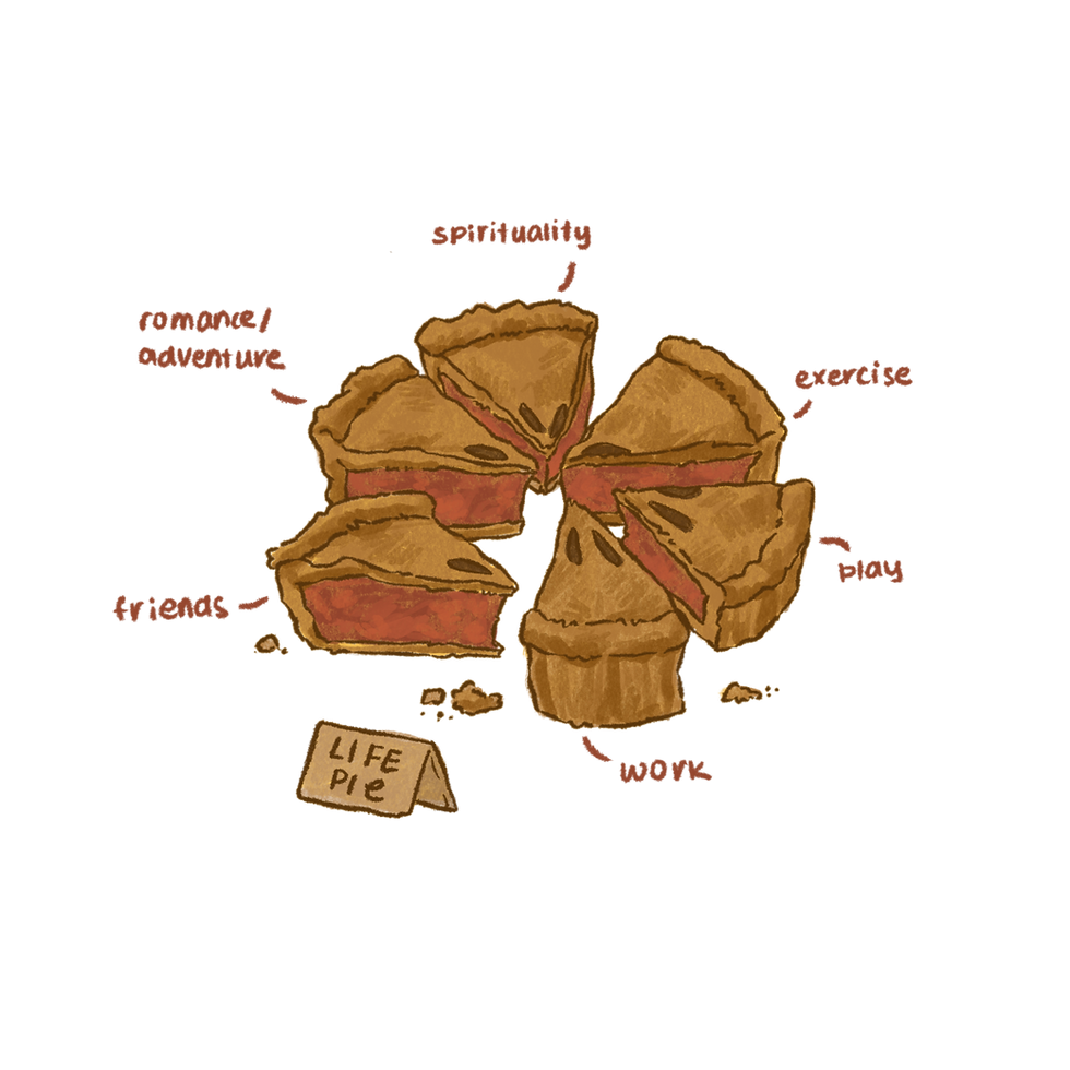
the task that followed the learnings from this chapter was the "life-pie" - imagine a delicious pie chart divided into six scrumptious slices, each representing a different aspect of your life.
Julia's message here? It's okay if your life-pie looks like a tarantula, with uneven slices galore. The key is to sprinkle just a tad of attention to each section to bring that sweet, sweet sense of fulfilment.
that has been my goal ever since reading this chapter. its pushed me to truly nurture different aspects of my life, and i can surely say, there is sense of fulfilment slowly making its way to me.


One of the biggest things that came out of this chapter was my reconnection with my favourite activities. the task was to list out 20 things that make your heart do a happy dance - the things you truly enjoy, note when you last indulged in these activities, and then go and do some of them now. and i did that!
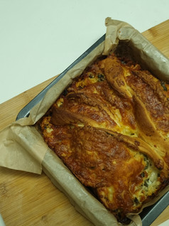
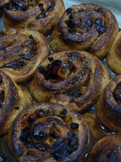
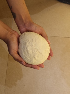
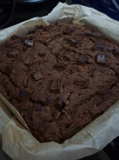
While there were a bunch of old favourites to revisit, there was one that tugged at my heartstrings – baking. i used to bake a lot a few years ago, but the college grind put that passion on the back burner. Well, guess who's back in the kitchen, flour flying and oven timer beeping?
Revisiting that phase of my life has been deeply healing, and i've found
myself a lovely new hobby.
making garlic bread, cinnamon buns, banana cake

this part of chapter 3 was a fascinating one. I've always believed in manifestation and the law of attraction, but as I delved into this chapter, it felt like the universe had cranked up its telepathic hotline just for me.
i've always called these weird instances "signs", or the "universe listening to me", But you know what? I've got a new favourite term for them now – "moments of synchronicity." and its crazy how things just felt like they were lining up, once i decided to pay attention to this synchronicity.
I'd have a brilliant idea pop into my noggin, and before I could even utter a word, someone would suggest it. I'd think about doing something in the coming days, and boom! The opportunity would waltz right into my life. Or I'd dream up an idea, and just like that, I'd stumble upon an online sign that screamed, "Bring this idea to life!" its such a refreshing and fulfilling task to notice these small moments of synchronicity.
"Shaming someone is an attempt to prevent the person from behaving
in a way that embarrasses us."

this was not one of the main tasks for this chapter, but it was a beautiful one nonetheless. Chapter 3 unveiled a little treasure trove of questions that sent me on an adventure back to my childhood, secret wishes, and deepest beliefs. Let me tell you, it was like a rollercoaster for the soul. These questions, some as easy as pie and others that required a little soul searching, led me down a path of reflection that was both exhilarating and, at times, a tad uncomfortable.
literally the first question on this list asked me to list my favourite childhood toy.. this I did not have to think twice. i wrote down 3 names - Rudolf, Chutki, and Jojo.

These weren't just toys; they were my trusty companions, my security blankets. Right after jotting down those names, I felt an almost primal urge to hold them again. So, I did what any intrepid explorer would do – I went on a treasure hunt! Thirty minutes of excavation later, there they were, resting in my hands like old friends reunited after years apart. (And yes, I did eventually return to that list, but not before admiring my favourite childhood treasures.)

now these 3 live alongside Ice Bear on my bed. And every night as I tuck myself in, I do so with a profound sense of calm. It's like I've created a protective fortress for my inner child.

oh i loved this activity. describing and drawing my childhood bedroom was deeply healing. ive always been that artsy kid. During my teen years, I was the DIY master, especially when it came to jazzing up my room with unique decor pieces. It was like sprinkling pieces of my soul all around my space, making it truly my own. i loved using my hands.

as i was drawing out each of the highlights i remembered from my room i had a profound realization - That 13-year-old spark of creativity, the one that made my room a masterpiece, is still very much alive in me. I realized that I'm constantly crafting and creating, just like I did back then.
honestly, whether you are reading The Artist's Way or not, everyone's gotta give this activity a try. Full disclosure, this activity did bring a tear to my eye, but hey, I'm the type to tear up at just about anything. But let me assure you, it's totally worth it.

So, that's where we are in our journey – currently cruising through Week 4 of the course, and it's been an absolute blast. I can't wait to see what exciting paths unfold in the chapters to come, and I'm thrilled to have you right there with me, experiencing it all :)
see you in week 5!
"The reward for attention is always healing."
Updated: Oct 10, 2024

let's take a look at the journey that CIBO, my final year graduation project went through.
incase you need a little backstory, "CIBO; YOUR MEAL PREP PARTNER" was my graduation project i presented for uni in May of 2023. CIBO is a full-service solution that provides you with pre-measured, pre-cut and "pre-ready" raw ingredients for recipes that make your life easier. This project involved the entire branding for this fictitious company, and the brand-building from scratch.
this is a journal entry of some of the behind-the-scenes photos of the process of bringing CIBO to life.
started from the bottom,

a little experiment before the project began - trying to
recreate the CIBO logo for my ceramics class

a another experiment - exploring a
3D model of the (then initial packaging)
the very first die-cuts that led to the final packaging - my initial design was inspired by a lunchbox shape. i later adopted a shape inspired by a grocery bag which fit the vibes of my project much better
the final packaging!

i also made some stickers with the illustrations that came out of CIBO to hand out
to the people who walked by my stall. also yes, i did cut them all out by hand.

some people also got these "NESSART16 Samplers", which was a little package I put together
containing my resume, the CIBO illustration memoir, an art print, some stickers and my business card
the illustration memoir i put together - immediately after i got them printed. this felt really special.

another incredible moment - my project brand manual, fresh off the printer.

some test prints ~
getting a laser cut acrylic logo done - this process was so interesting to watch!

photography exploration for the ad campaigns - i wanted to recreate
a simple kitchen scene at home that featured CIBO in use

the picture that came from the set-up

this is the idea i had initially - the fact that sundays can
be reserved for kitchen dance parties; and CIBO would take care of the meals

the other idea - a version of this one made it to the final display

getting some sunboard displays printed - these were so huge!

my initial idea for my stall design - apart from a few things, i was really able to bring my vision to life

the night before the final show - hours and hours of setting up


is masking tape my best friend???
we were making a placeholder for the display boards here to see what they looked like in action

the final set up
and we're done :)


the and that's me! and yes, i matched my outfit to my stall colours for all the days we were set up.


and then we got to here.

"To effect a creative recovery, we must undergo a time of mourning."
18th July, 2023 - the day I found myself embracing a thrilling new challenge. I bought myself a copy of the The Artist's Way, and promised myself to the 12 week course that the book lays out.
In case you're not familiar, "The Artist's Way" is a captivating and immersive self-help gem penned by the talented Julia Cameron. It's like a creative reset button, guiding you through an intensive process of creative rediscovery. I picked up this book after watching Apple Cheeks share her journey. Inspired and eager, I decided it was time to embark on a similar adventure of my own.

For quite some time now, I've felt this creative block weighing me down. Life seemed to fly by without offering those much-needed moments of respite - from my hectic last few days at uni, to venturing into the world of my freelance work straight away. Traditional breaks just weren't cutting it, I craved something that would ignite the spark of creativity within me again. So, here I am, ready to embark on a journey of self-discovery for the next few weeks - a chance to fix and remix my artistic soul from the ground up.
Here's to hoping that this blog serves as my personal journaling space, where I share my experience and journey with you. The ups and downs, the takeaways, the struggles. All of it. Without giving away too much of the book's process and structure, this is my way of documenting my recovery. so I hope you'll tag along :)


The very first thing I did was sign a "creative contract". Picture this: a playful (but actually very serious) oath to stick with this adventure, regardless of how intense, emotional, difficult, frustrating, exhausting it gets. It may have seemed silly at first, but that contract has become my trusty companion, serving as a delightful reminder of why I took up this artistic challenge in the first place.


The book requests that you write morning pages, the first thing you wake up and do. Its a stream of consciousness writing where you write whatever thoughts come to your head. There are no edits. What's in your head is on the paper.
The second is the weekly solo artist date. You take yourself out on one date every week, and treat yourself to an artistic adventure. As long as it serves your creative soul, it counts.

I've always been a journaler, and it has been therapeutic for me to unload my thoughts and feelings on paper. It is something that has helped my process my emotions and troubles from my days, and I have stuck to it for a long time. But theres just something about doing these morning pages that feels different. I'm pretty much brain vomiting onto the paper all of my thoughts that are passing by. But still somehow, it has helped me organise my mind. And even though I was already a journaler, the structure of morning pages did bring about a change in my mindset.

5 year old Ness would be really proud of me.
We also bought a bunch of journal stickers. Completely letting go of perfectionism, and putting on this child-like charm towards the morning pages. This practice has been so healing for my inner child. I don't really care about if the stickers look aesthetic or not, I'm just having fun.
And buying more stickers.
But oh, the first few days of this wild ride, I must admit, my words were dancing around like a bunch of crazy party animals. It felt incoherent and muddled. But guess what? It didn't take long for them to find their groove and settle into a rhythm.
I started to hold space for my emotions and stand up for myself. In the past I have put myself down about my mistakes, creative or not, may-a-times in my life, but doing this exercise pushed me to stand up in my defence, and in the conversation between me and my journal, I found myself saying, "Its okay. She's learning. And she is capable. She'll make it." (even though that still came after scolding myself a bit sometimes. But its okay. She's learning.)

These morning pages have been my secret weapon against pesky anxiety monsters. I am able to step out of the dynamic and reason with myself - explain to myself that things are okay, and I am capable of dealing with them and I am strong. One of the things that has really helped with that is the practice of affirmations, and the turning of all negative, self-limiting believes into self-assuring mantras.
It felt silly at first, repeating to myself "I am capable". Because I didn't believe it. But as the days went by, I was able show myself proof that I am in fact, very capable. (!!!) I think that is such a powerful thing to discover for yourself. And so important too.


The book made me personify that negative voice in my head. Meet "Killmonga," the silly, ugly monster of my self-limiting thoughts. And dont ask me how I got to that name. I thought of the meanest, scariest name that sounded mean and scary, and this was the first thing that popped in my head. So I'm rolling with it.

Picture him with warts and just one eye because, you know what, he can't see the beauty in things, and zero arms because he hates creating things with his... well... what would've been his hands. "he is stupid", I wrote. This activity was really satisfying to do. Seeing my fears personified, looking like an ugly monster gave me this sort of energy I did not expect. And it makes them seem slightly more easy to deal with.

Alright, now the solo artist date. Boy. This was big for me.

cheesecake & iced tea @ a Starbucks
Venturing out on solo artist dates is a rare occurrence for me, but this week, I decided to break the mould. because the book told me to. Initially, I chose a lovely little spot near my house, planning to sketch while enjoying some pizza. However, soon enough the anxiety crept in, and I ended up at a Starbucks instead. Even there, I felt nervous, constantly worried about what others might be thinking.

At first, I kept my eyes glued to the pages, not daring to look up, or even start sketching. But as time passed, I found my rhythm, gaining confidence and even sneaking peeks at the world around me. Eventually, I mustered the courage to begin, but I couldn't shake the feeling of being judged by others. Using references from a gallery visit a few days ago, I managed to ease into the process, but for sure, doubts lingered.
But you see, despite the fear and self-doubt, I'm proud of taking that first step. My inner child artist applauds me for facing the anxiety and spending time with my sketchbook. Looking back, I realize my skills weren't even as terrible as I thought in the moment. It was an empowering experience, nudging me closer to stepping outside my comfort zone. And let me tell you, my inner child artist is throwing confetti right now.

ran into this random trail on the way to Starbucks. pretty, no?

One of the most powerful exercises I did was the letter to the "editor". This seemed a little difficult to navigate, and after a lot of research I had a template. But let me tell you, i did not stick to it.

You see, I unleashed my inner storytelling genius and wrote in the third person, channeling my higher self - Ness from the future, perhaps. She's woman who has figured it out, and isn't held back by her own thoughts. It was like an epic defence of everything I've been through - the good, the bad, and the hilariously messy. Y'all. I cannot tell you how incredible this letter turned out to be for me.
I didn't try to sugarcoat my mistakes or over-explain them. Instead, I tapped into my courage and requested a bit of softness from the "editor" as they peered into my life's adventures. After all, I've braved some tough times, and a little compassion wouldn't hurt. That was an important thing for me to accept.
Too often I've been too hard on myself, doubting my capabilities and fearing the spotlight, beaten myself over the fact that I'm not at a certain place in life, I haven't achieved something or that I'm not even capable of getting there. I've felt too scared of getting big, taking up space. But writing this letter helped me gain a different perspective, take a stand for younger Ness who wasn't able to do that for herself, for reasons that were out of her control. That it wasn't the path she was meant to take.

And obviously, we went all in and put these lovely letters in the mail. This was in fact, the cherry on top. Postage stamps, letter box, we did it all.

And that was my first week of The Artist's Way. A rollercoaster of emotions for sure. This week showed me the real demons that try to scare my creativity away. It taught me to defend myself. Anxiety may try to play its tricks, but I'm learning to show it who's boss. That's me.
I haven't been with this book to long yet, but its a treasure on my shelf already. I am really excited to see the adventures that await me, the rest of the journey that the lovely Julia Cameron has mapped out for us, and obviously, you are coming along with me.
I'll tell you how week 2 goes! Talk soon okay? You're doing great <3
lots of love, ness
#theartistsway #artistdate #artchaallenge #juliacameron #snailmail #sketching #journaling #artjournal #sketchbook #illustration

